For this project, I interpreted the text from Mike Monteiro’s Essay, A Designer’s Code of Ethics visually based on my response to it.
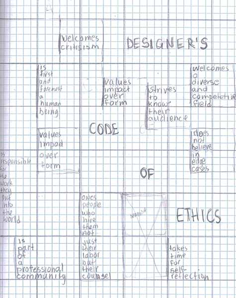
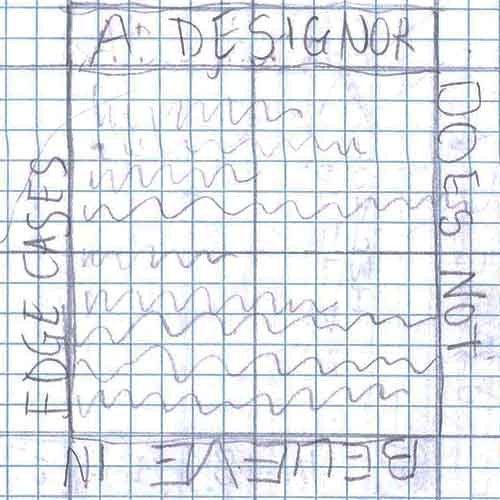
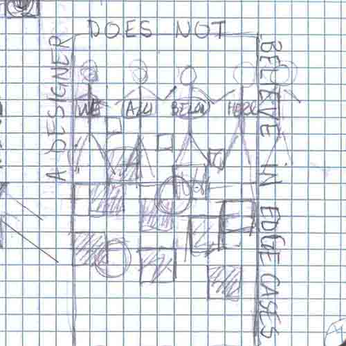
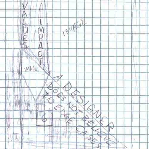
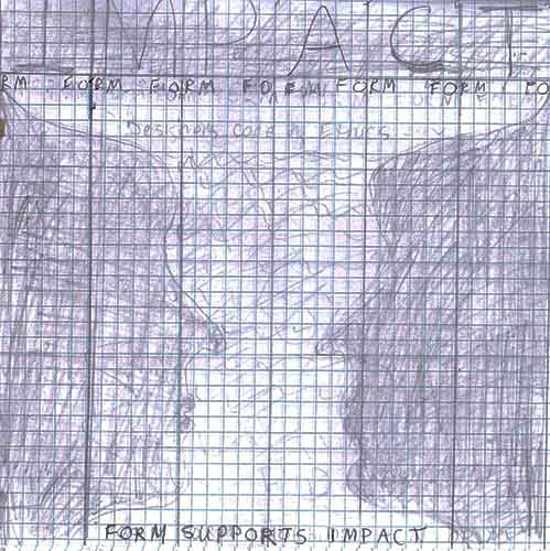
Designs Based on a Grid Structure
The grid form dominates both of these designs. The first did not say much about my responses to the “Code of Ethics”. In the next, I highlighted parts of the “Code of Ethics” that were most meaningful to me. My next step was to explore some of these visually.
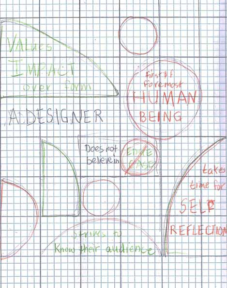
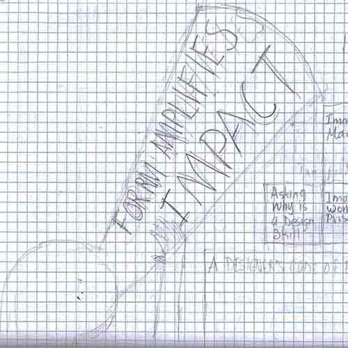
Visual Exploration: A Designer Values Impact and Does Not Believe in Edge Cases
A Designer is a Human Being and Takes Time for Self-Reflection
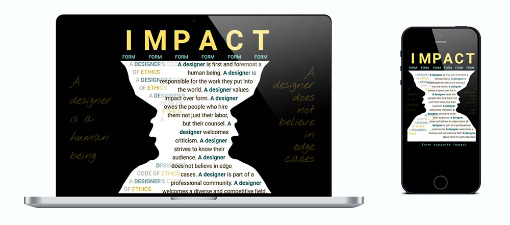
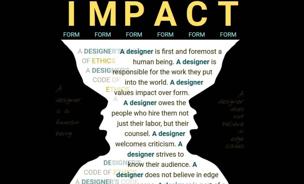
This Rubin’s Vase visually communicated these two aspects of the Designer Code of Ethics. The vase was also a “form” that I could place “IMPACT” over to represent “a designer values impact over form”.

Putting It All Together
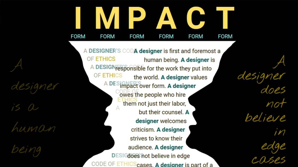
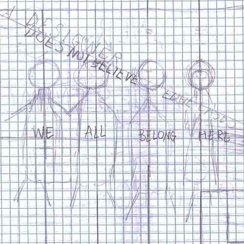
In the process of discussing and getting feedback on my project, I realized that the two profiles could represent two people looking at one another, a designer and a user of the design, for example. With that in mind, I added “A designer is a human being” to the left profile and “A designer does not believe in edge cases” to the right. In each case the text lights up on hover.
Developing the Page Using HTML and CSS
My first steps were
- Create profiles as svg images using Photoshop and Illustrator.
- Place all of the content into a 6-column grid with a maximum width of 800 px.
Wrapping the text to the side of the profiles
Technically, this was the most challenging part of the project, since text would normally wrap around the box containing the profiles, rather than the profiles themselves. My solution was
- Place the left profile and “Designer Code of Ethics” text together in a div spanning the 5 left columns of the grid.
- Float the profile to the left and set its max-width to 40%.
- Recreate the profile outline in CSS using shape-outside:polygon( ).
- Repeat the process on the right with the right profile and remaining text.
Making the page responsive
I wanted the page design to be visible and look similar at all screen widths. I also tried to use a minimal amount of code to make the page responsive. My solution included
- All content within a responsive grid.
- One media query at 800 px, the maximum width I had set for the content.
- Above 800 px, the font size for most of the text stayed the same.
- Below 800 px, the font size for all of the text was calculated using pixels and viewport width, for example “font-size: calc(1.8vw + 9px)”.
- Font-size, margin, and padding were calculated at all screen sizes for the text on the profiles.