Project Type: Poster
Skills Needed: InDesign, Photoshop
Context
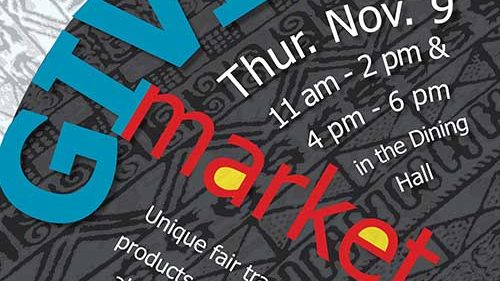
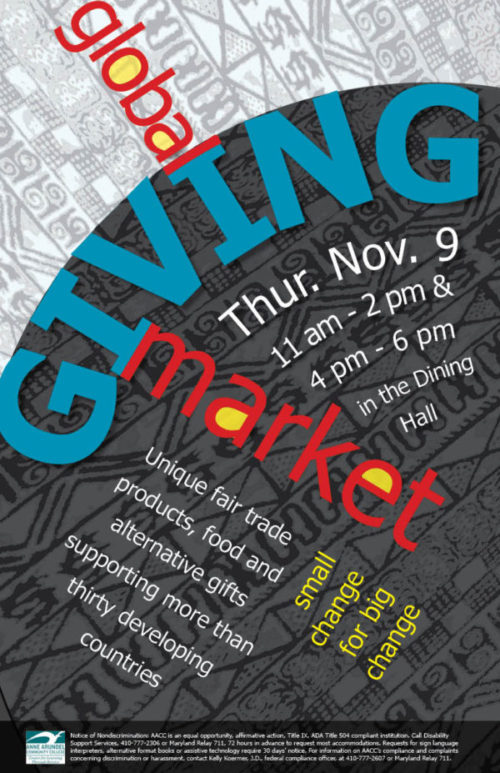
This poster was designed to advertise the Global Giving Fair at Anne Arundel Community College.
Global Giving Market
The Global Giving Market sells fair trade items from around the world. Many of these items can be seen in the online SERRV catalog and include food, jewelry, and a variety of items made from cloth. They often include styles, symbols, and motifs that are traditional in the countries in which they are made. I also looked at a variety of text-based posters to get ideas about ways to design the text.
The Fabric of Giving
My original design ideas were based on items in the SERRV catalog and similar items that I have at home. The concept that I ended up using in my poster started with combining images created from photographs of West African cloth with a diagonal text. My original design had all of the text laid out at the same angle. I revised it to make the text more interesting. First, I made “Giving” the dominant element and set it on a circle to give the gestalt impression of a globe. Then, I set “global” and “market” at angles that would allow the “l” in global and the “m” in market to interact with the “I”s in “giving”. This produced 3 different orientations for my heading text.
After trying several different cloths for the pattern, I chose this one for several reasons. I liked the look of its strong lines and structure. In addition, it is based on Adinkra symbols. These symbols are used in traditional Ghanaian pottery and wood carvings as well as in Adinkra cloth and have symbolic meaning that is often based on proverbs.
I made my text for “global giving market” the biggest and the brightest so that it would be at the top of the hierarchy and lead the eye through the page. It took me a while to figure out how to create enough contrast between the background pattern and the text. To do this, I eventually used a somewhat transparent white layer to make the top pattern very light, and a somewhat transparent black layer to make the bottom pattern dark enough for white text to be easily read. I organized the remaining text by proximity, color, and direction.