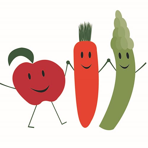

Logo Design
The goal of this project was to design two logos for the Anne Arundel County Food Bank, one that included the text, and one that was square and did not contain text.
Inspiration
Based on their recent newsletter the Food Bank wanted to focus on “distribution of fresh produce, perishables and other healthy food options”, so my design process started with the concepts of “fresh produce”.
Initial Sketches
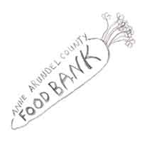
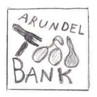
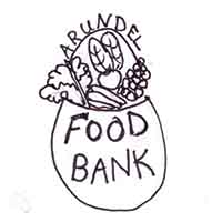
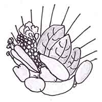
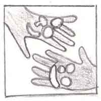
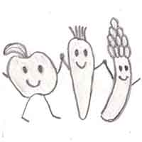
All of my designs include fresh vegetables or fruit, and since the green and orange colors of the organization worked well for carrots, many included carrot images.
Design Concept
I selected two of my initial sketches as the basis for my logo designs.


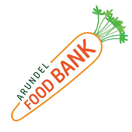
Both logos include a carrot which is a common, easily identified vegetable that works well with the green and orange color scheme. The graphic-only logo, also depicts an apple and asparagus. The apple is also a familiar and easily identifiable food. In addition, it is commonly eaten fresh, without being cooked or cut up, and has connotations of health (“An apple a day keeps the doctor away.”)
Based on my research, the Anne Arundel Food Bank also values the teamwork of individuals and organizations working together toward a common goal, so I depicted this with vegetables and fruit holding hands in my graphic-only logo. Working together is represented by holding hands. The smiles, curved shapes, and holding hands all convey friendliness and approachability. The different shapes, colors, and “hairstyles” of the food characters convey diversity in both the groups and individuals that are working together and the gifts that they bring to the table.

Promotional Newsletter
The promotional piece contains basic information about the Food Bank, my logo, and a photograph from the Food Bank Facebook page that communicates people working together. I used the orange and green colors as borders and to highlight parts of the text.
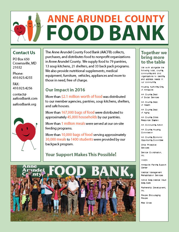
The hierarchical structure of the page is established by using larger text size and green and orange colors for the headings and more important text. Borders, headings, and spacing are used to group related parts of the promotional piece. Apart from the white background and black text, I used mostly the green and orange color that are representative of the Food Bank. These near complimentary colors, along with the red of the apple help the document to convey energy. The text blocks form soft, open shapes, which I think is appropriate for the organization.